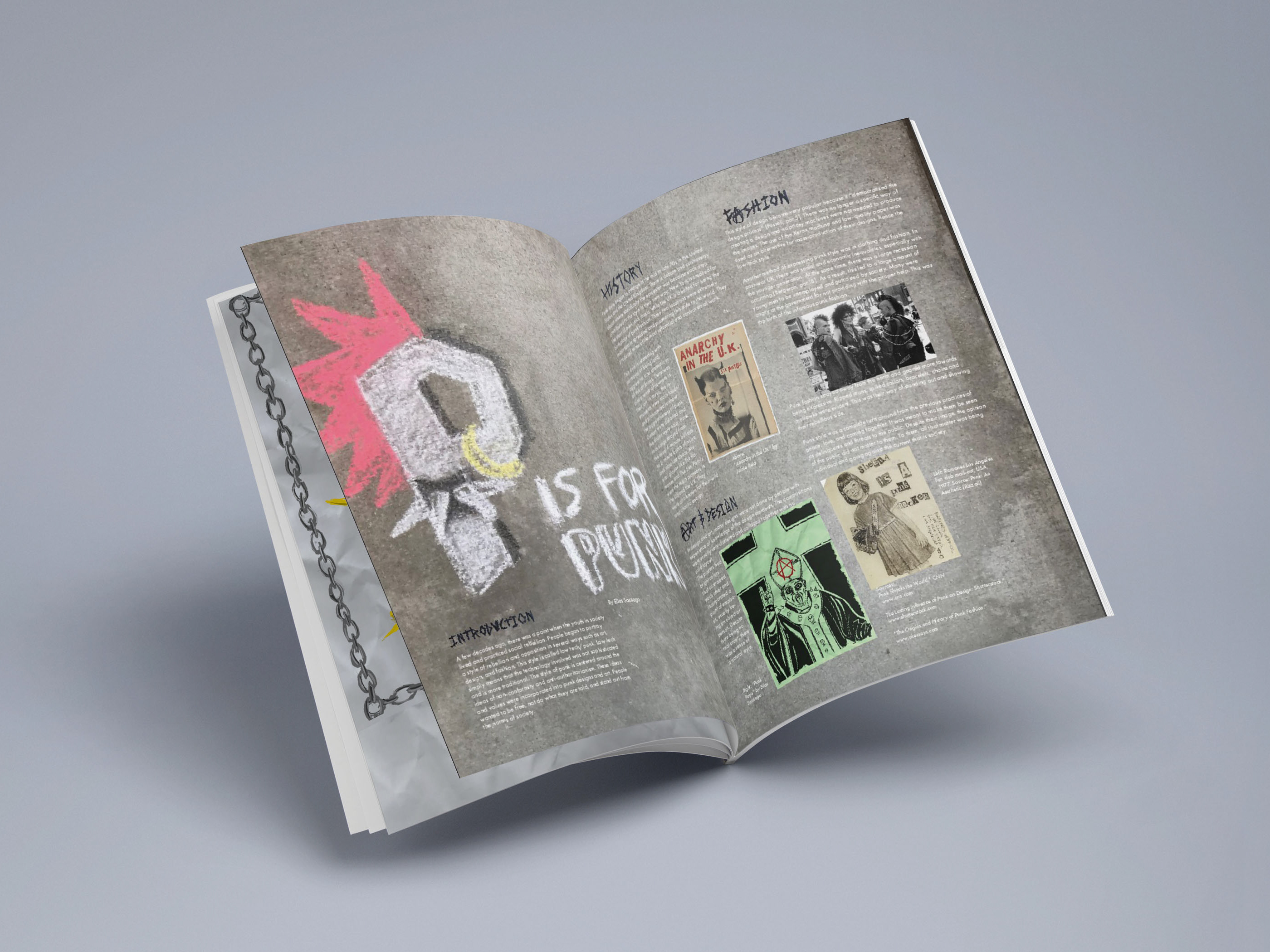
Overview
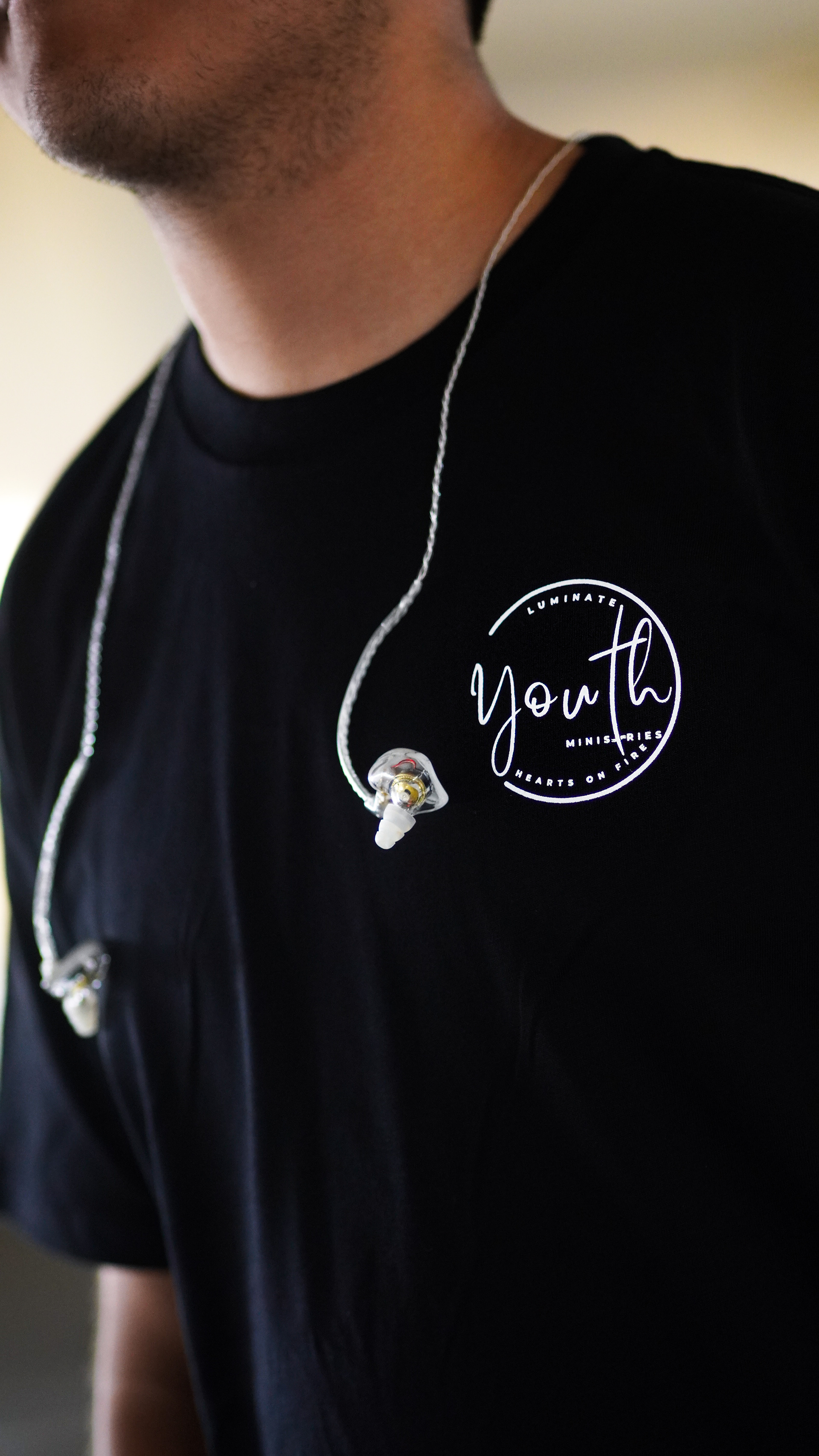
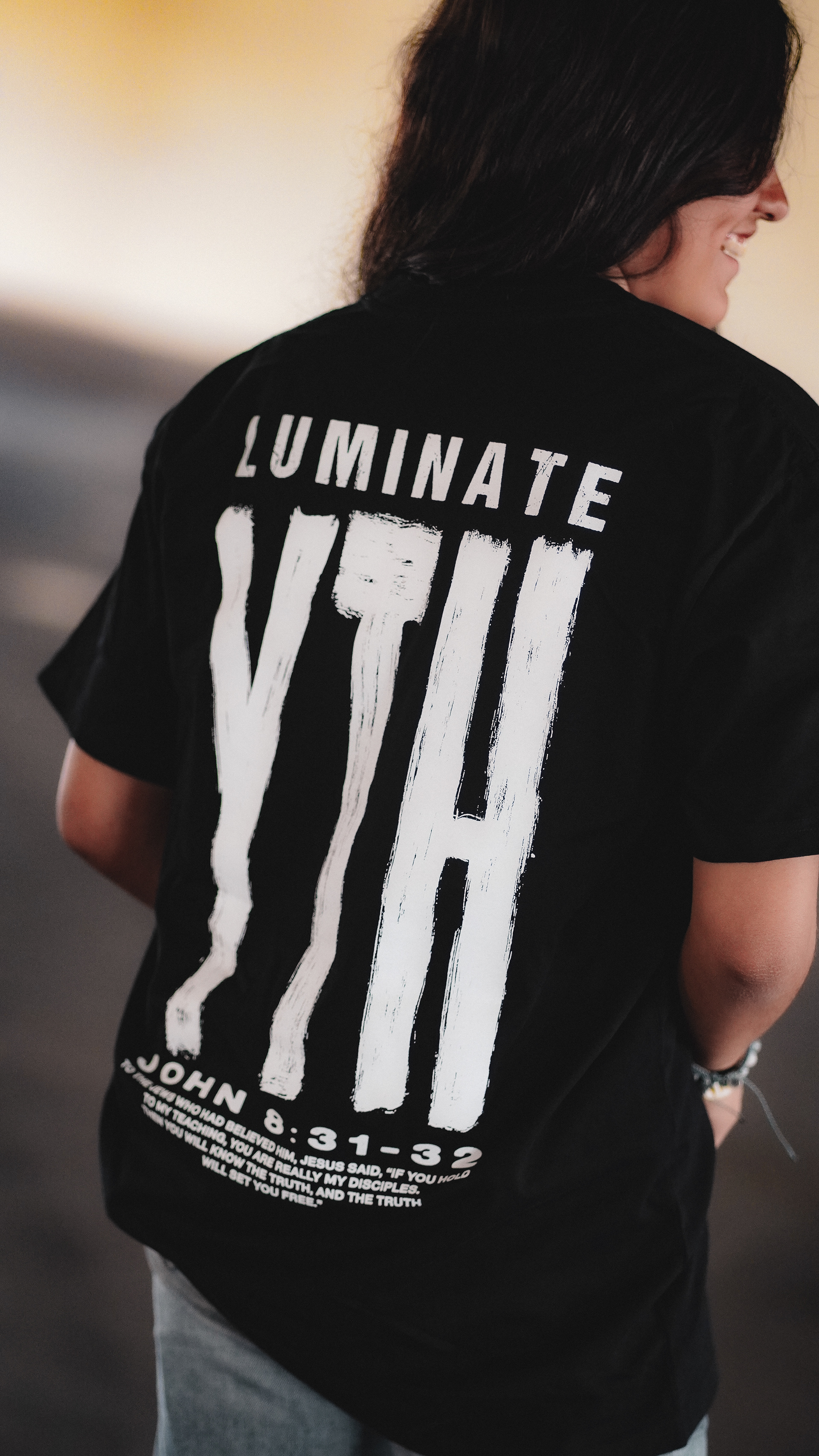
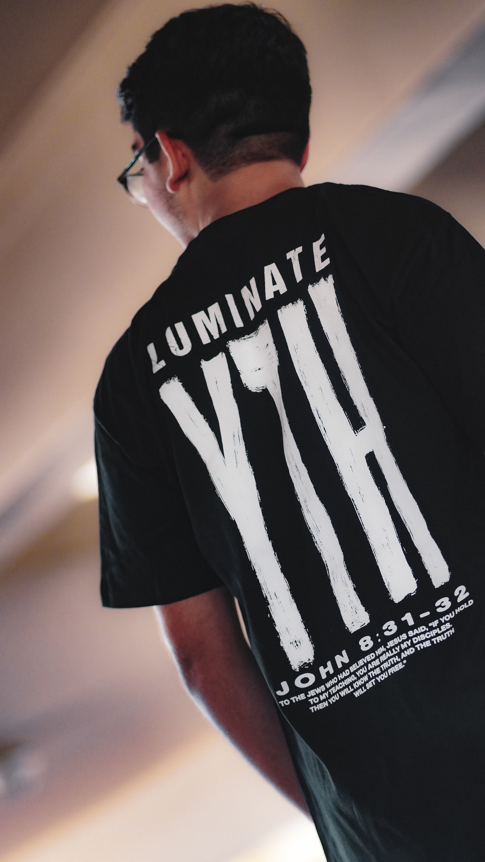
I was presented the opportunity to design a t-shirt for a local church youth group. The goal was to design a merch that would be the youth group's brand identity.
Tools;
Adobe Photoshop. Analog & Digital
Sketches & Typeface
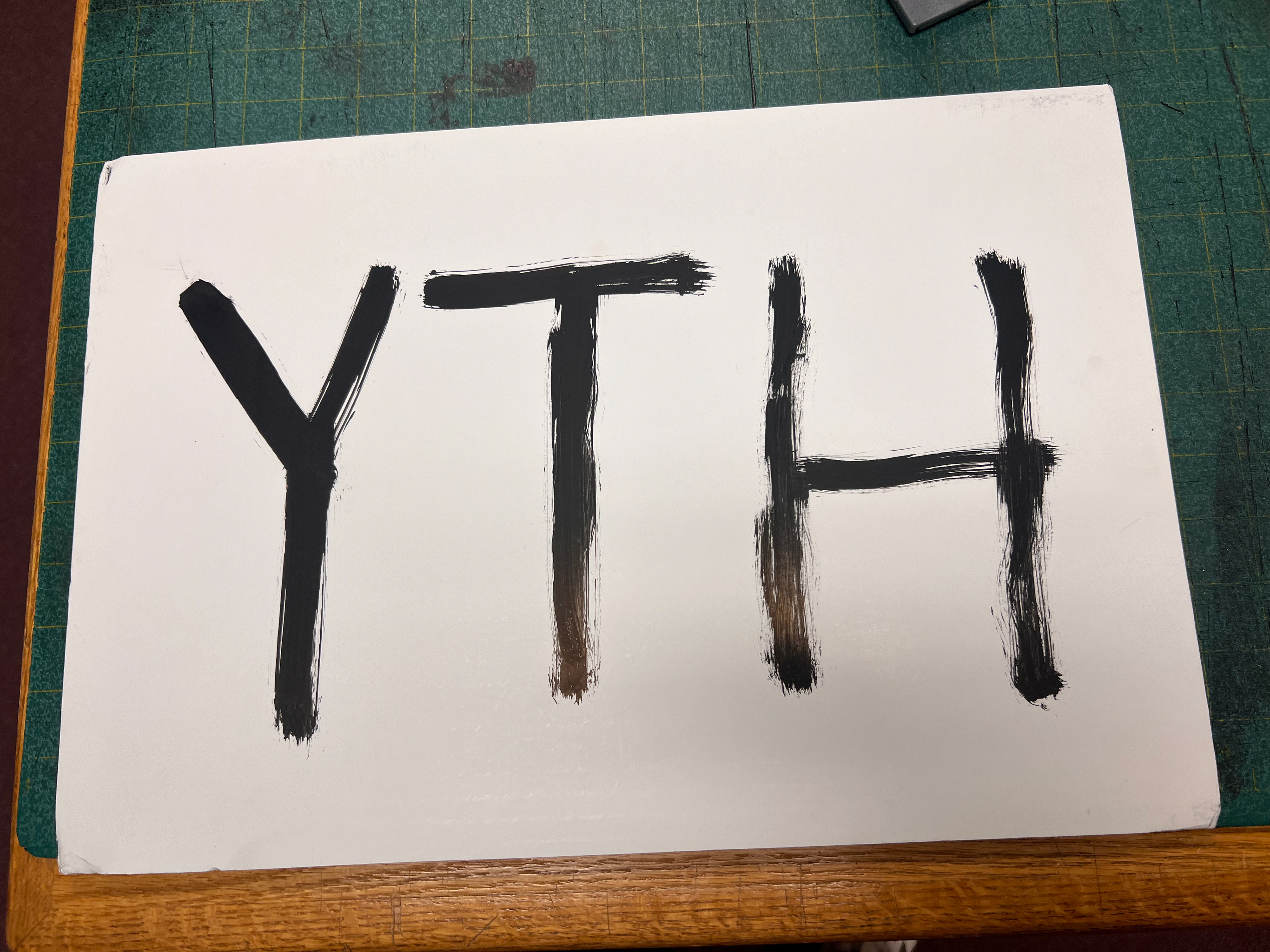
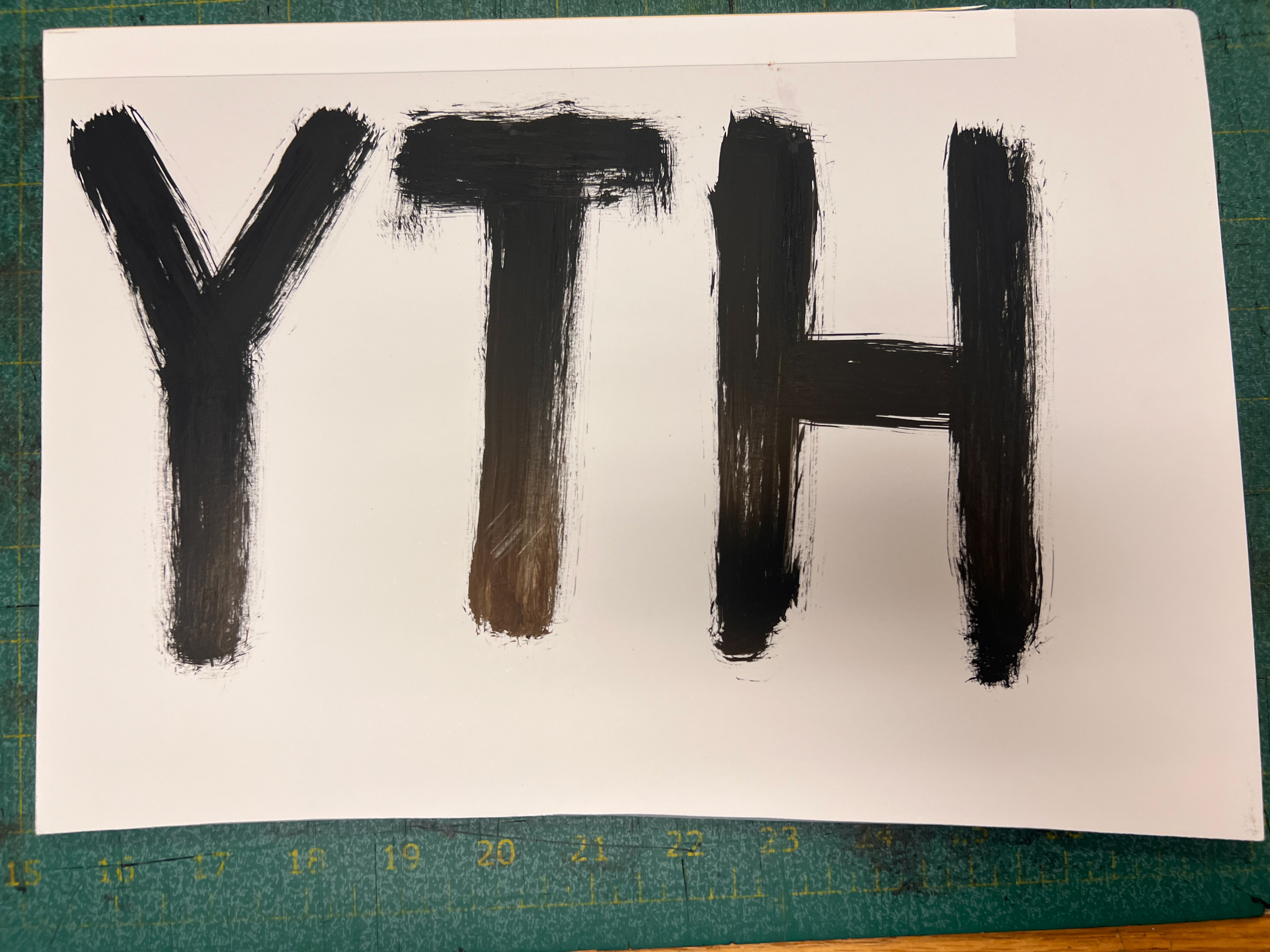
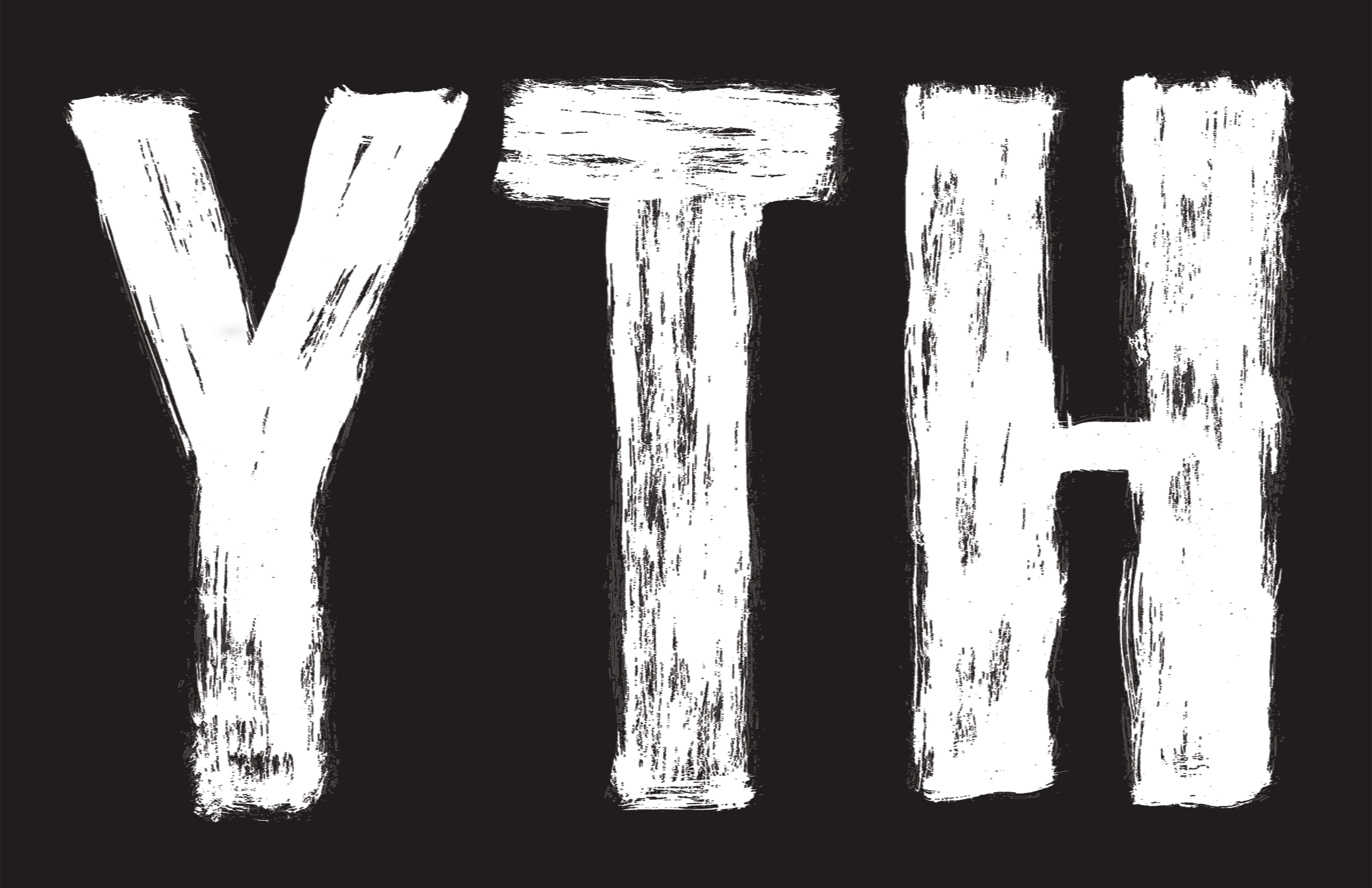
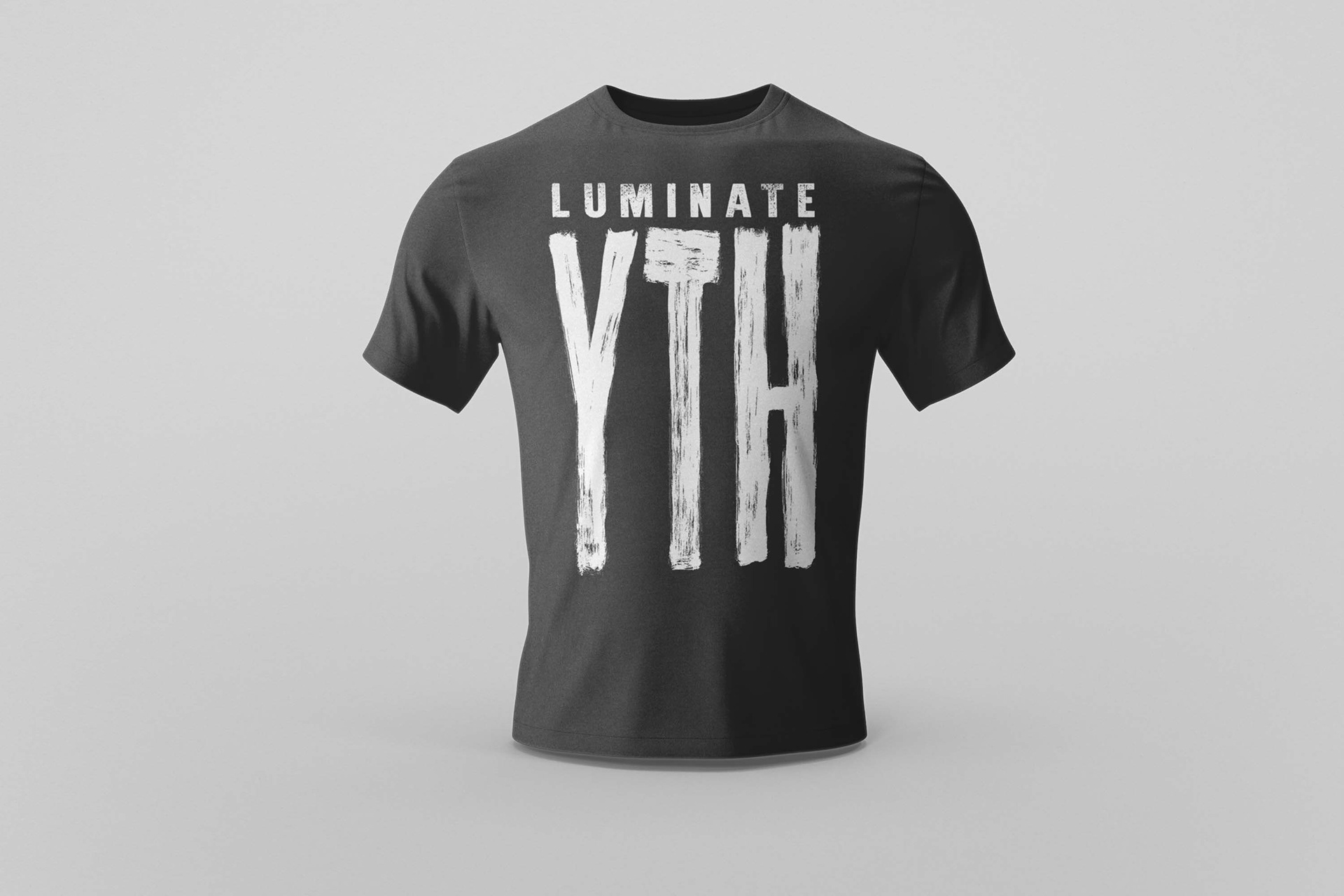
The goal was to make the initals bold and rough to reflect the properties of youth and being young. I had settled on making the initals in all capital but playing with different line weights. To make it look rough, I used ink and brush and tried different strokes on paper.
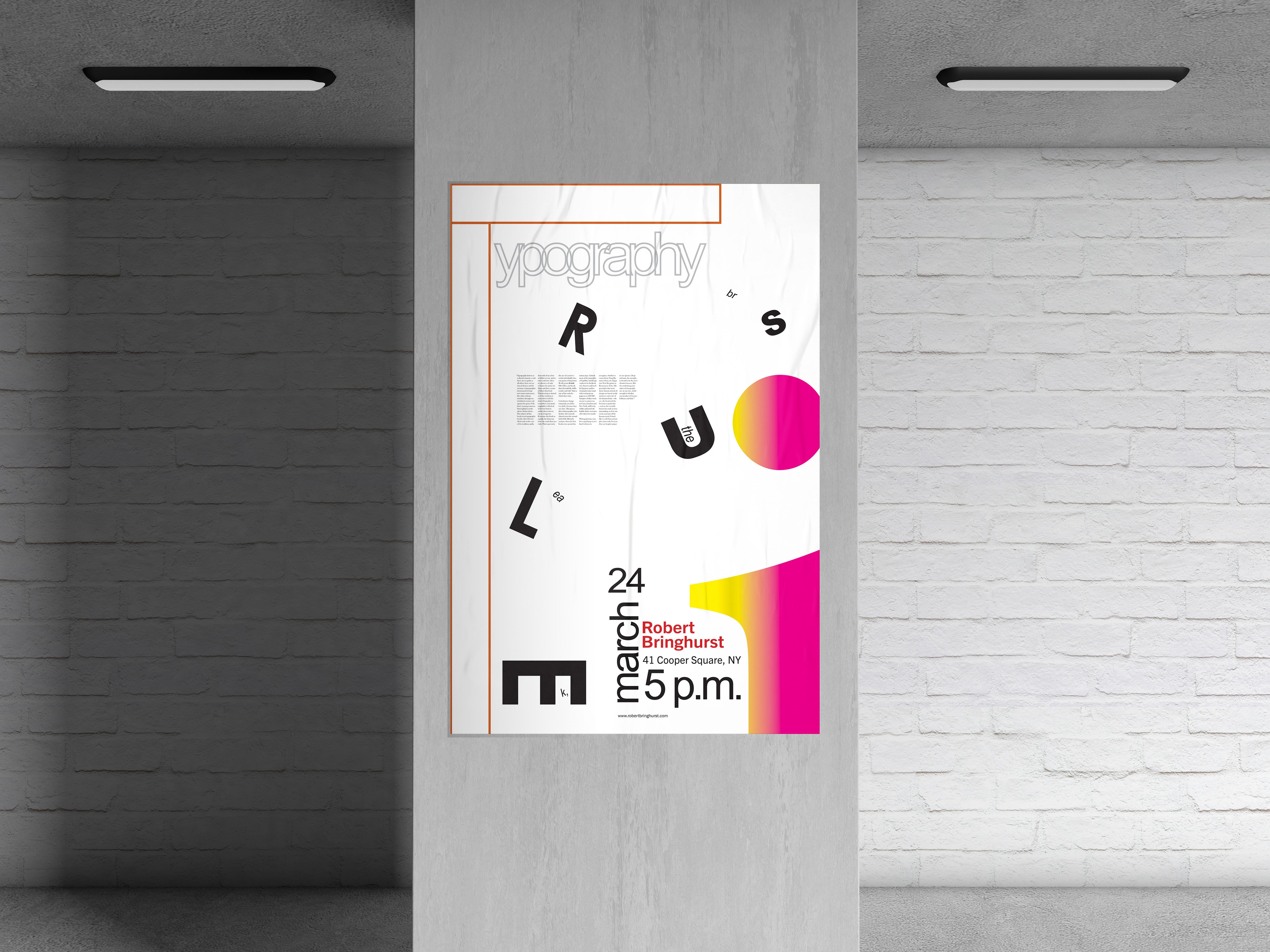
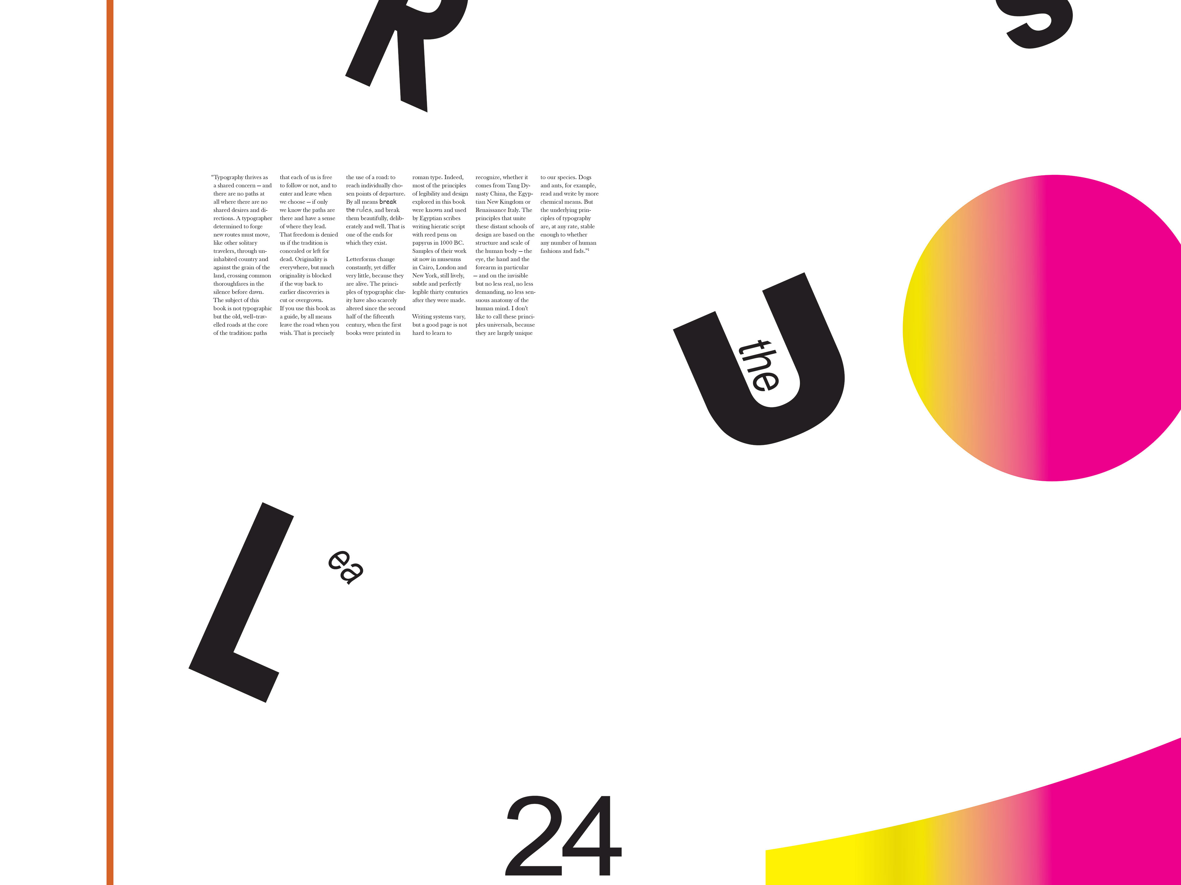
Main Typeface
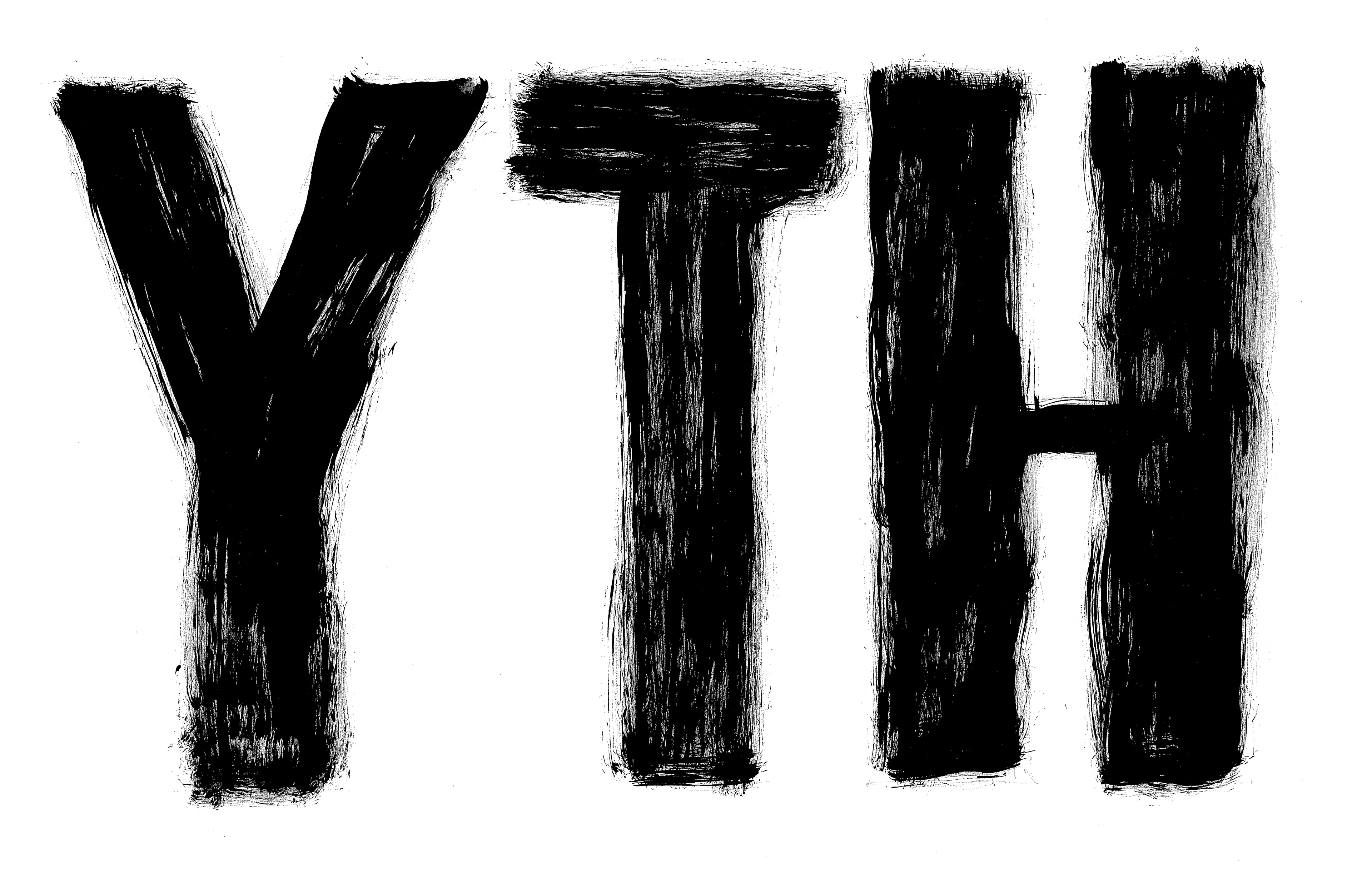
For the typeface, I decided to use a sans-serif font to emphasize the bold aspect that the client wanted to stand out. I scanned the painted letters and create a a B&W variant to be used on differenct color materials. From there, it was a matter of experimenting with the tlettering and trying different weights.
Experimenting with the Design
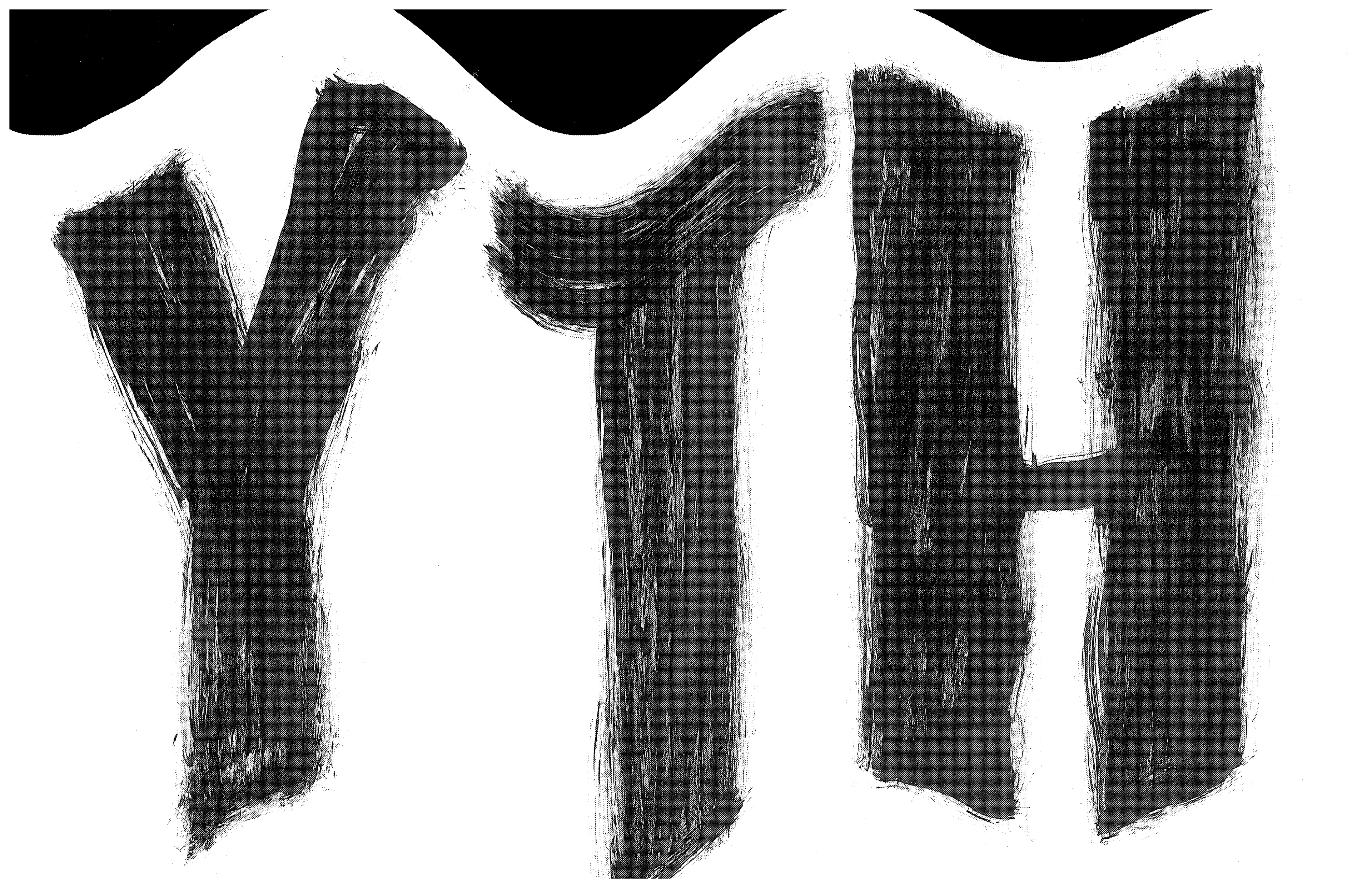
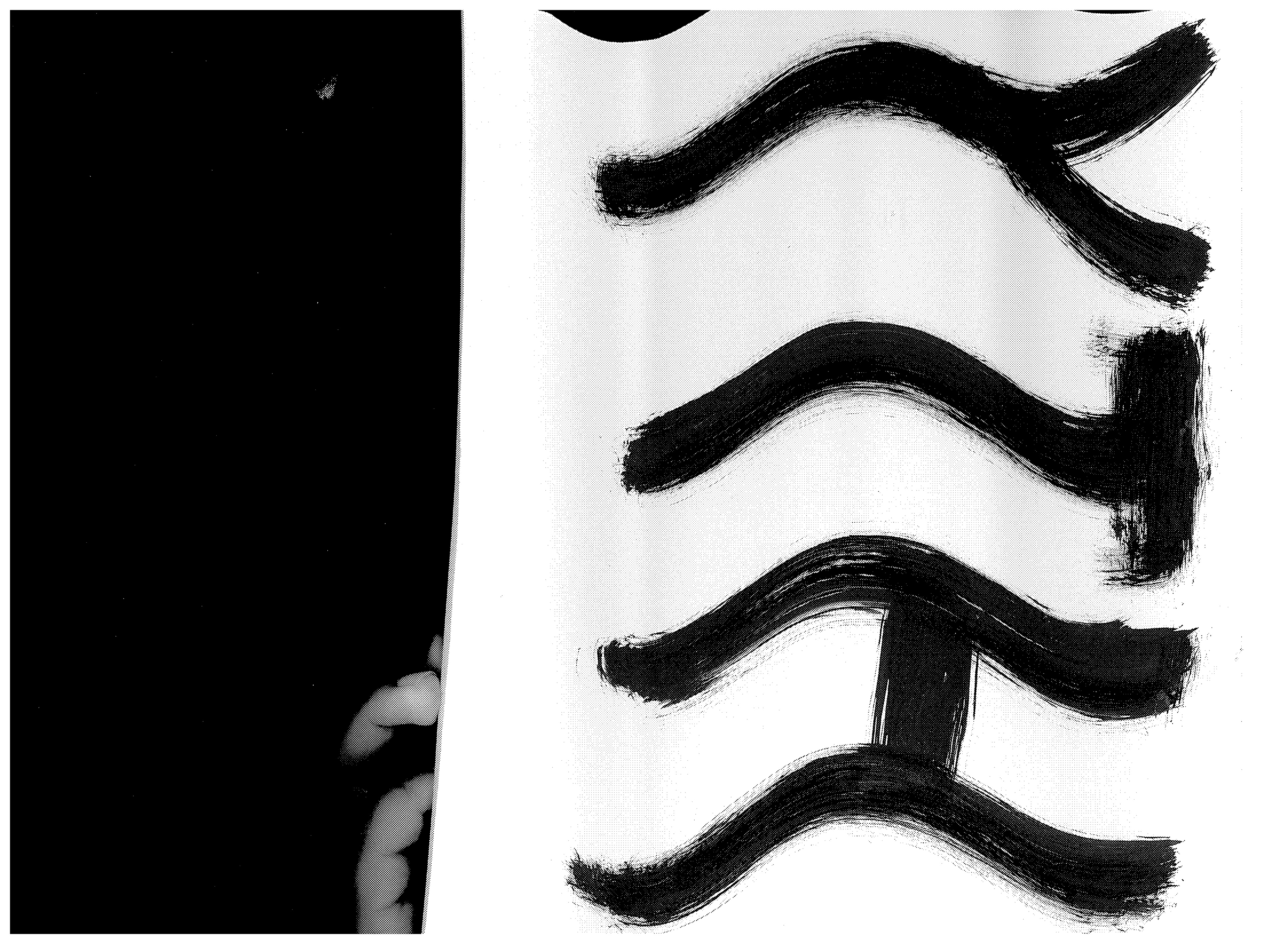
I experimented with different techniques including scanning to see how it can change the design without relying entirely on digital manipulation. Ultimately, I decided that it was not having a desirable effect so it was never incorporated into the final design. Regardless, it was useful to see how type manipulation can change the design.
Experimenting with the Design
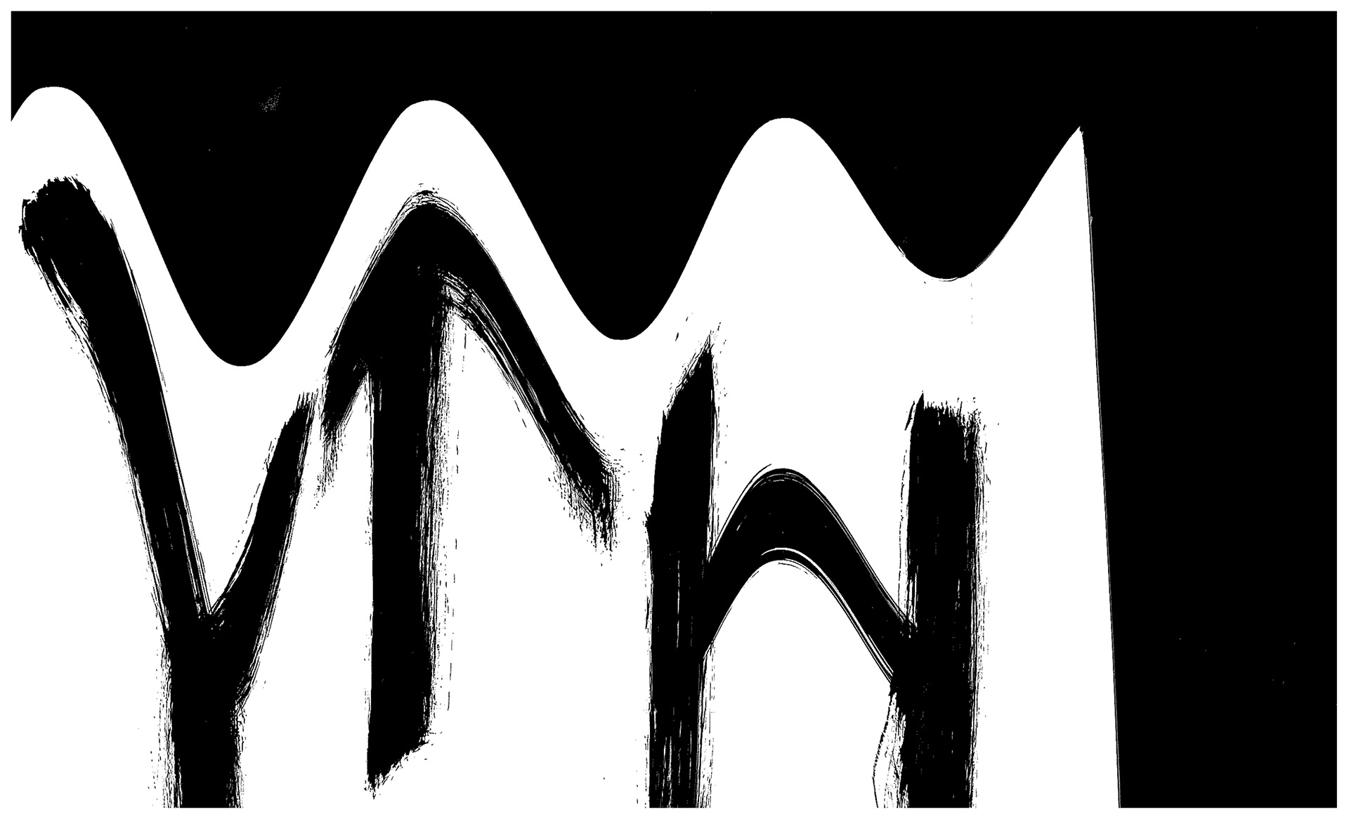
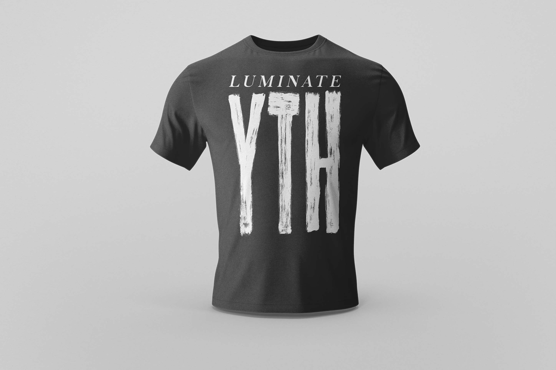
Several variations of the design were made to determine the secondary typefaces to accompany the bold letters and have a nice balance between light and heavy weight type.
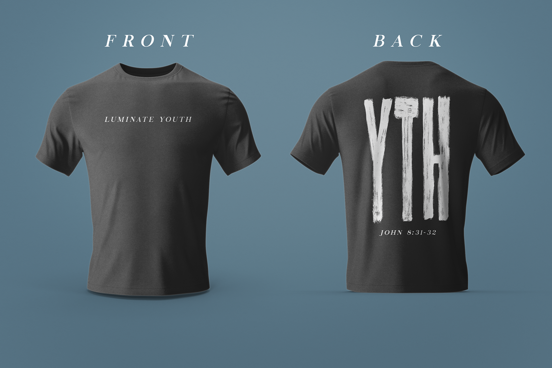
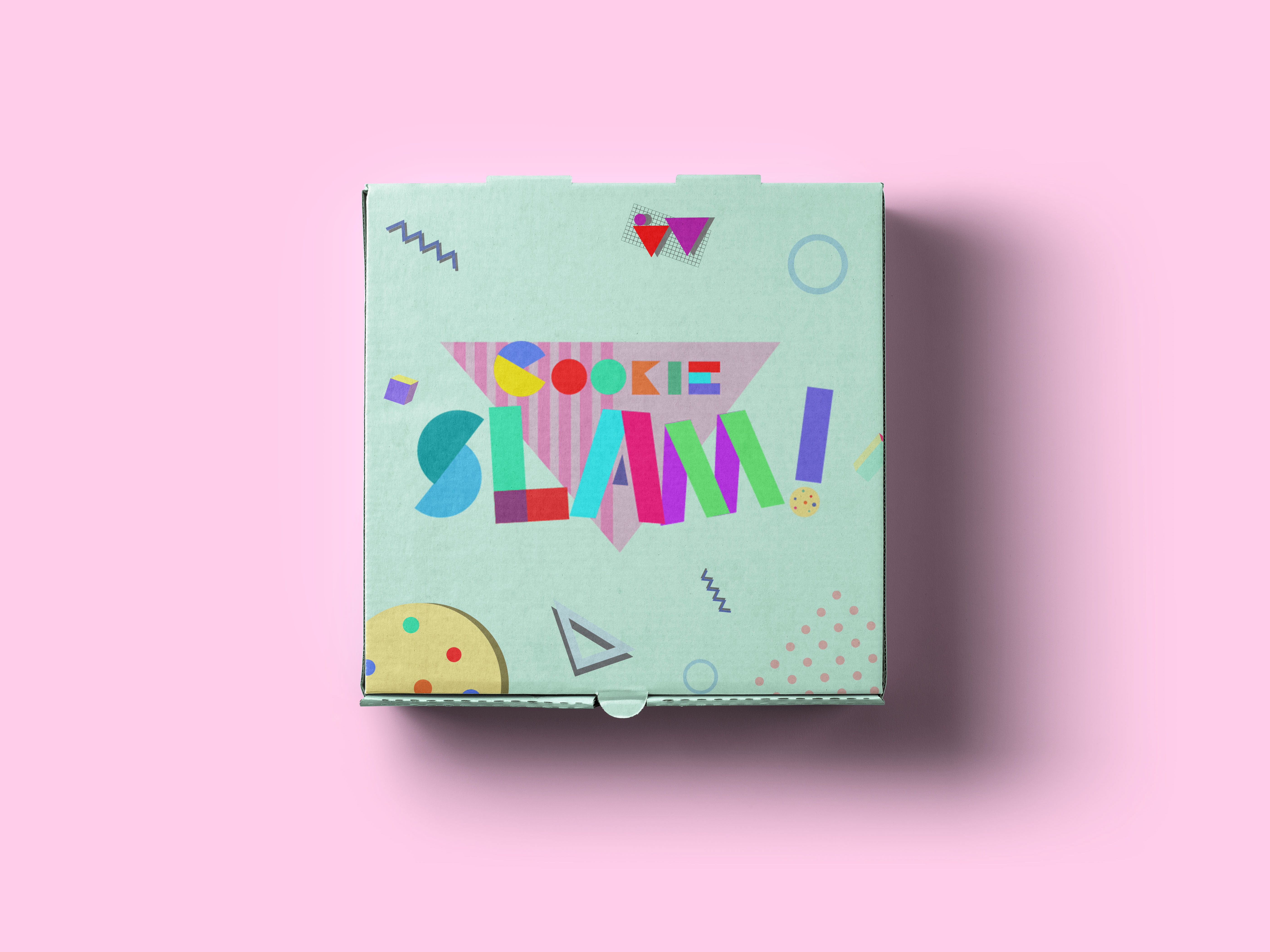
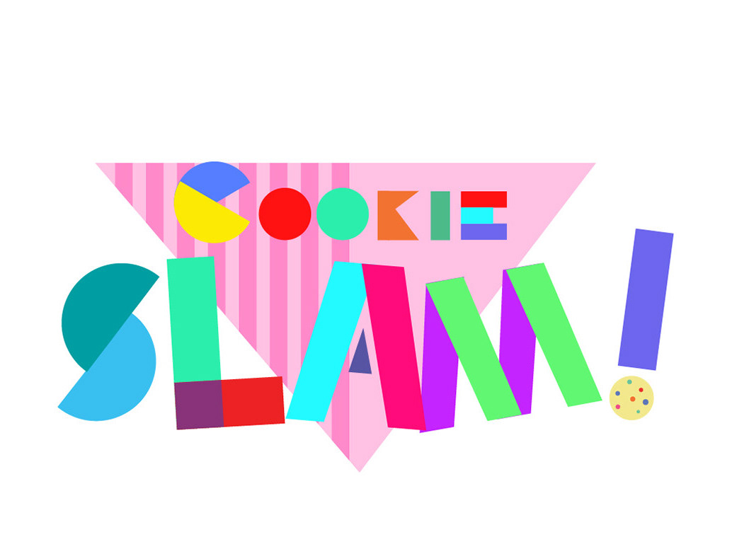
The final design included the youth group's existing logo that is utilized use for their branding as well as a their choice of verse. An effective way to deliver a message by simply wearing the shirt rather than speaking.